How Wes Anderson Uses Color Palette to Secretly Predict the Ending of Their Movies
Let’s be honest: we’ve all, at least once, looked at a frame in a Wes Anderson film and thought, “I want my living room to look exactly like that.”
There’s a mesmerizing, sweet color combination in his work that’s instantly recognizable. You can take a pixel out of his films, and a film connoisseur can tell you not only which film it is, but also guess the specific emotional disorder being targeted. It’s a world of perfectly panned shots, meticulous symmetry, and flawless pastel beauty.
But to dismiss Anderson’s world-building as mere hipster entertainment completely overlooks the cinematic subtlety unfolding beneath the surface.
In the architectural grammar of cinema, color is traditionally used to evoke immediate, real-time emotions: red for passion, blue for melancholy, green for stillness. Typical Hollywood films use these color palettes to tell you how you’re feeling right now. However, Anderson, acting as a chess grandmaster and interior designer with obsessive-compulsive disorder, doesn’t just use color to reflect the characters’ current psychological state; he uses it as a Trojan horse in the story.
If you look closely at his most iconic masterpieces, you’ll realize that Anderson’s color palettes are essentially structural maps. They’re not merely decorative; they’re actively whispering the film’s ending directly onto your retina from the very first frame.
Let’s analyze the visual language of this most brilliant and purposeful filmmaker, and see how his circles of color secretly determine the fate of his characters long before the credits roll.
1. The Chromatic Trap: Bliss as a Precursor to Decay
To understand how Anderson uses color as a predictive storytelling tool, we must first consider the reversal of his standard color theory. In most of his films, a bright, warm, highly saturated color palette signals safety, joy, and a happy ending ahead. Anderson completely reverses this scenario. In his universe, the more beautiful, uniform, and highly saturated the space, the greater the potential for destruction.
For Anderson, an absolute color culture represents the desperate attempts of his eccentric characters to build a wall against the chaos, unpredictability of real life, aging, and grief. Therefore, when a film begins with a strong, suffocating commitment to a single vibrant color, the narrative trajectory is mathematically predetermined: that visual oasis is bound to collapse.
Color is not a promise of happiness; It’s like a beautifully wrapped bandage on an open wound. The ending is foreshadowed not by the introduction of new plot points, but by the gradual depletion or inevitable violent breakdown of that dominant theme.
2. The Grand Budapest Hotel (2014) — The Millennial Pink Mirage of a Dying Epoch
Nowhere is the technique of color prediction more brilliantly executed than in The Grand Budapest Hotel. The film is widely remembered as a feast of vibrant pinks, soft lavender purples, and the aesthetic beauty of creamy pastries. It is the most visually exquisite treat. But consider the storytelling, because the film’s timeline tells you exactly what that pink means.
The story of the legendary hotel manager Monsieur H. Gustave and his loyal waiter, Zero Moustafa, is told through layers of memory spanning three different eras. When we are in the glorious timeline of the 1930s – Gustave’s golden age – the hotel is a powerful, uninhibited explosion of vibrant pinks, royal purples, and deep reds. It feels timeless, inviolable, and utterly romantic.
But Anderson deceived us. That particular shade of pink belongs to the world of Mendl’s pastries. It’s artificial, fragile, and easily perishable. By engulfing the 1930s hotel in a hue that looks like a real cake, Anderson wants to tell the audience that this entire world is destined to be destroyed and annihilated. You can’t preserve a cake forever.
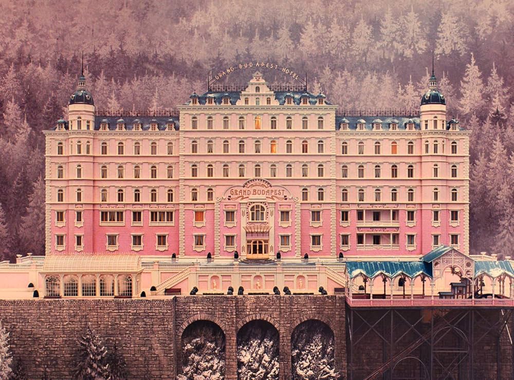
The color palette subtly foreshadows the tragic end of Gustave’s world by visually expressing nostalgia. Nostalgia only exists for things past. The intense pink is a warning sign that we are looking at a ghost.
And what happens as the film progresses and the darkness of fascism creeps into the story? The pink is systematically stifled. It’s replaced by harsh, oppressive shades of gray, deep black, and blood-red flags.
By the time we shift to the 1960s timeline, the hotel has been swallowed up by the harsh, pragmatic aesthetic of the Soviet bloc, defined by mustard yellow, ochre, and pale olive green. Pink has completely disappeared, and modern staging techniques further strip away color, leaving us with monochromatic, sterile shades of gray.
The film’s ending, where Gustave is shot dead, Agatha dies of illness, and Zero wanders in the empty shell of memories, is laid bare from the very beginning. Pink was never a backdrop; it was a countdown to the demise of romanticism.
3. The Royal Tenenbaums (2001) — The Crimson Uniforms of Stagnant Grief
If “The Grand Budapest Hotel” used color to foreshadow the end of an era, “The Royal Tenenbaums” uses it to foreshadow the emotional turmoil of a severely fractured family.
The Tenenbaum family is a group of former prodigies who reached their peak in their youth and spent their adult lives wallowing in failure, resentment, and depression. To cope with this, each character seems to freeze themselves in time. They wear exactly the same clothes they wore when they were twelve years old.
Look at the color distribution among the characters. Chas Tenenbaum wears only a bright, flashy red Adidas tracksuit. Margot Tenenbaum dons a heavy, grayish-beige fur coat and sharp eyeliner. Richie Tenenbaum is stuck in a beige tennis polo shirt, sunglasses, and a striped headband. The color choices here are striking, but notice what they lack: evolution. For the first two-thirds of the film, these colors are utterly static.
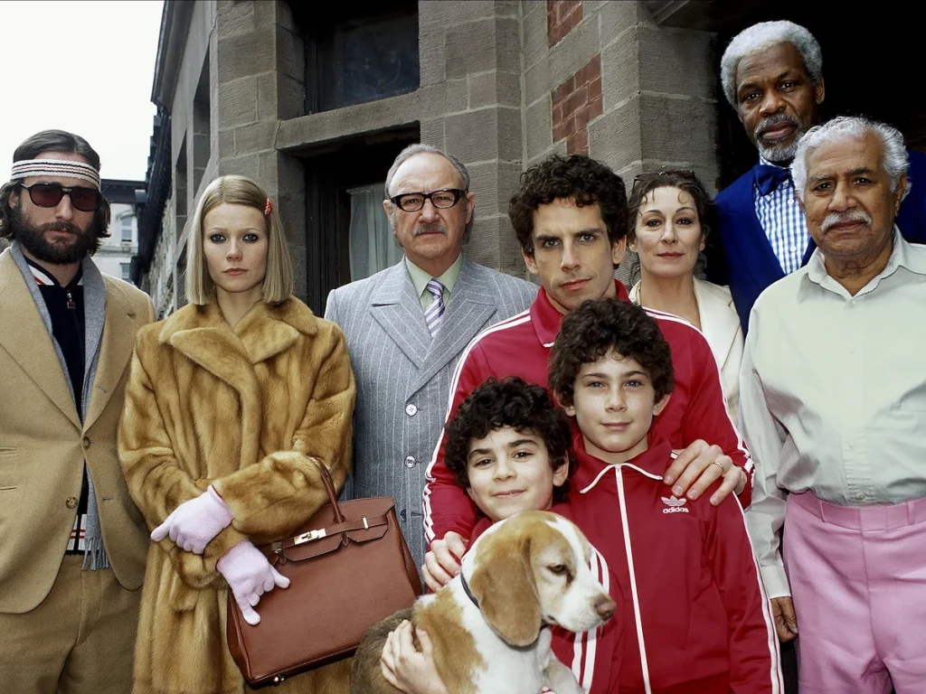
Focus on Chas’s red tracksuit. Red is the color of heightened alertness, panic, and danger. Chas is haunted by a morbid fear of death and catastrophe after losing his wife in a plane crash. By having him and his sons wear identical red outfits repeatedly, Anderson subtly foreshadows that Chas cannot find peace within his current psychological framework. Red is a working, screaming alarm bell, signaling to the audience: this character is in a state of constant emergency.
The secret prediction of the ending lies in how these colors are separated. The climax of the film’s emotional arc doesn’t occur in a single dramatic monologue; It happens when Richie Tenenbaum enters the bathroom, locks the door, and systematically removes his personal image. He shaves, removes his headband, and cuts his hair before attempting suicide.
While in the hospital, Richie is stripped of his beige tennis uniform and wrapped in a neutral, muted hospital gown. He has shed his childhood aura.
The film concludes with the death of the head of the family, Royal Tenenbaum. At his funeral, the characters reunite, but the visual context has subtly shifted. The colors are no longer the aggressive, isolating hues designed to separate them from the outside world. They begin to blend together; the frames become more natural, intimate, and less rigidly color-coordinated.
The initially stifling color palette foreshadows that the family can only heal if their childhood images are completely destroyed. Royal’s death was foreshadowed because he was the only character wearing the traditional, classic grey suit – he was a relic of the past that needed to disappear so that the vibrant but wounded children could finally change their attire and grow up.
4. The Life Aquatic with Steve Zissou (2004) — The Fading Cyan of a Mythic Man
“The Life Aquatic with Steve Zissou” is perhaps Anderson’s most profoundly melancholic film, and its predictive color coding is intimately connected to the psyche of the protagonist, brilliantly and coldly portrayed by Bill Murray.
Steve Zissou is an aging oceanographer whose career is fading, whose best friend has been devoured by a legendary leopard shark, and whose marriage is falling apart. To combat his looming obsolescence, Steve forces his crew to adhere to a rigid and highly specific visual identity: bright blue uniforms paired with high-contrast, internationally-inspired orange-red beanies.
This color combination is no accident; it’s a masterful lesson in complementary color theory designed to convey the film’s tragic premise.
Blue and orange are opposite each other on the color wheel. When placed side-by-side, they create a powerful contrast, generating intense visual tension. In Steve’s world, the blue symbolizes the vast, cold, and isolated environment of the ocean—and, more broadly, his profound loneliness. The red woolen hat is a literal cry for help. It’s a visual lament into the void, a desperate attempt to be seen, to be valued, and to anchor himself from the deep blue abyss of his own failures.
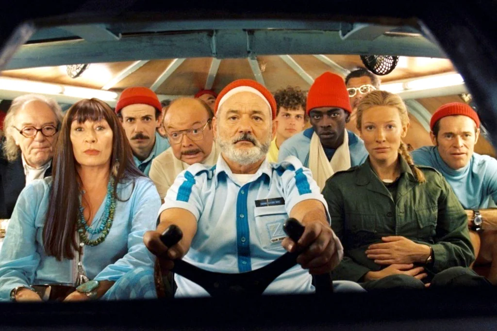
The film subtly foreshadows its ending by diminishing the saturation of this blue. As Team Zissou runs out of money, is attacked by pirates, and loses Ned Plimpton—a young man who may or may not be Steve’s son—the vibrant, bright blue of the uniforms begins to look faded, yellowed, and worn. Illusions are rotting from the edges.
This foreshadowing is ultimately rewarded in the climax beneath the submarine in the deep sea. When Steve finally confronts the Leopard Shark, he doesn’t kill it. Instead, the scene shifts from the controlled, artificial light of Steve’s world to the pitch-black, bioluminescent natural world of the deep ocean.
Inside the submarine, the faces of the crew members are bathed in soft natural light, dimming the aggressive blues and reds of Zissou. Steve gazes at the beautiful yet terrifying creature and asks, “I wonder if it remembers me?”
The color palette foreshadowed from the start that Steve’s journey wasn’t about hunting monsters; it was about shedding his carefully crafted, artificial persona to merge with the vast, emotionless reality of nature. He had to let the cyan fade so he could finally see the true colors of the world around him.
5. Moonrise Kingdom (2012) — The Amber Glow of an Endangered Childhood
Let’s move on to Moonrise Kingdom, a film that looks like it was shot through a lens completely immersed in liquid French mustard, classic scout khaki, and the warm amber hues of autumn.
Set on a remote New England island in the summer of 1965, the film tells the story of Sam and Suzy, two twelve-year-old outcasts who run away into the wilderness. The dominant color here is a deep, muted golden yellow – a color that immediately evokes a psychological response of profound nostalgia and the warmth of the countryside.
But see how Anderson uses this yellow to foreshadow the film’s dramatic ending. The yellow in Moonrise Kingdom isn’t the bright, vibrant yellow of a cheerful morning; it’s a deep, dense, atmospheric yellow, possessing the characteristic quality of the air just before a world-changing storm. It feels beautiful, yet incredibly heavy.
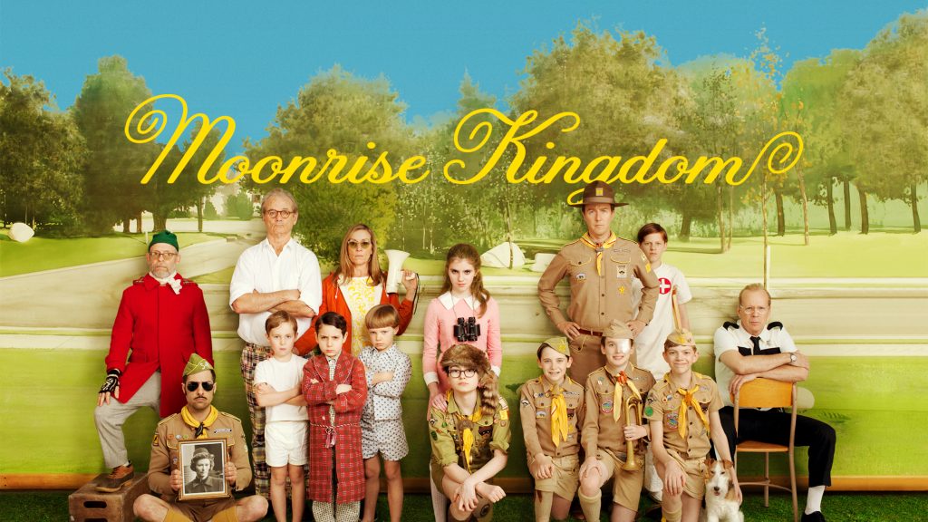
From the opening scenes, the local island narrator warns the audience that a historic storm is heading straight for the community. The color palette does the narrator’s job. Scenes tinged with reddish-brown and amber hues look exactly like a collection of old photographs that have withered and yellowed with time.
By enveloping the entire film in this threatened warmth, Anderson subtly tells us that this summer is a finite, ephemeral ecosystem. The childhood freedom that Sam and Suzy are pursuing cannot last forever in the real world.
When the final storm hits in the third act, the yellow is completely wiped out by the cold, grayish-blue and muddy brown rainwater, a dangerous color. The children are forced to take refuge on the church roof as the floodwaters rise.
However, the ending delivers a beautiful reversal, foreshadowed by the small, high-contrast splashes of color that Suzy carries throughout the film: her bright pink dress and her blue music player. While the adult world is shrouded in drab, monotonous gray raincoats, the children retain their distinct visual identity.
The film concludes with Sam painting a landscape of the small bay they had escaped to – and he uses the very same warm golden paint. That color palette foreshadows that, while the summer of 1965 will be physically ravaged by the harsh realities of adulthood and the actual storm, the emotional scene they create will be preserved forever as an artistic memory.
6. Fantastic Mr. Fox (2009) — The Earthy Red of Primal Surrender
Even while operating within the realm of stop-motion animation, Anderson’s predictive architecture using color coding remains impeccably tight.
Fantastic Mr. Fox is an absolute masterpiece of monochrome world-building. The film is entirely covered in a rustic, rural color palette of foxy orange, burnt reddish-brown, wheat yellow, and deep apple brown. You’ll find virtually no cool colors in the animal kingdom’s main world.
This strong commitment to the warmth of autumn reflects Mr. Fox’s internal conflict. He is a wild animal desperately trying to play the role of a civilized, domesticated man, living with a family, writing newspaper columns, and wearing a fine tweed suit. The warm, vibrant orange elements in his house and wardrobe represent his wild, untamable nature—the human part that craves hunting, stealing chickens, and running around in the mud.
The secret prediction of the film’s ending lies in how this orange color interacts with the human world. The cruel farmers—Boggis, Bunce, and Bean—are represented by cold, mechanical, industrial colors: pure white, factory gray, and dark, somber gray.
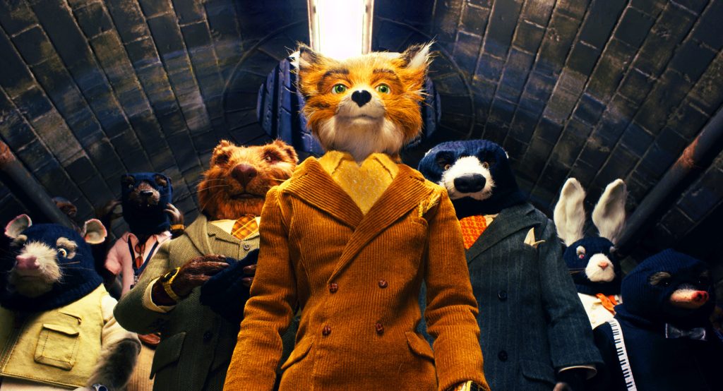
When the farmers declare war on Mr. Fox and use giant excavators to dig up his hill, they are attempting to strip away the natural golden soil and replace it with their own gray industrial barns.
The film’s ending is foreshadowed by the fact that the animal characters never lose their orange warmth, even when they are completely pushed underground into the sewers. They are physically trapped beneath the concrete of human civilization, but their environment remains strongly enveloped by the warm golden light of the underground.
The final scene takes place inside a brightly lit human supermarket at night. It was supposed to have a sterile, corporate feel, but Anderson filled the shelves with a plethora of gleaming gold boxes of Boggis chicken and Bunce cider. The color palette from the outset predicted that Mr. Fox could never return to his traditional wild hill—but more importantly, it predicted that humans could never truly tame or conquer his primal spirit. The animals win not by reclaiming the surface, but by invading the human corporate world with their own untamed, orange energy.
7. The Master Key: How to Read an Anderson Frame
Once you learn to read Wes Anderson’s movies through the lens of predictive color theory, you realize he has given you the blueprint to his entire cinematic universe. The next time you sit down to watch one of his films, skip looking at the plot mechanics for a moment and ask yourself these three visual questions:
- What is the “Monopoly Hue”? Identify the color that completely dominates the environment. Is it a soft pink? A harsh mustard yellow? A clean, nautical cyan? This color represents the central illusion or psychological defense mechanism of the narrative. The character who built this space is trying to keep something out, usually grief, time, or reality.
- Where are the “Visual Magnets”? Look for the tiny, high-contrast bursts of color that disrupt the monochromatic uniformity. A bright red tracksuit in a beige house; a bright pink dress in a sea of khaki. These visual magnets are the cracks in the armor. They show you exactly where the emotional pressure points are, and they predict the precise catalyst that will eventually cause the entire central illusion to implode.
- How does the Saturation Evolve? Pay attention to the third act. Does the color get systematically drained, turning into natural, muted, or gray tones? If so, the movie is predicting a tragic but necessary surrender to reality. If the color shifts but retains its vibrant intensity, the characters are going to successfully preserve their beautiful, eccentric inner worlds, even if the physical reality around them has been completely reduced to rubble.
Conclusion
Wes Anderson is often accused by his detractors of prioritizing style over substance, turning his movies into nothing more than beautifully curated, lifeless dollhouses. But that critique fundamentally misunderstands the core engine of his visual storytelling.
His style is his substance.
By using color as a hidden narrative engine, Anderson has achieved something truly remarkable in contemporary cinema: he creates a dramatic structural tension between what we see and what we feel. He encapsulates his story within the warm, fantastical aesthetic of a childhood fairy tale, while simultaneously using the underlying structure of color to prepare our subconscious for the inevitable arrival of adulthood, loss, and change.
Color is not just for making the frame look beautiful. They’re there to tell us that all beautiful things are fragile, every empire is destined to fall, and every bizarre uniform must eventually be taken off. He doesn’t need a shocking plot twist to surprise you at the end of the film. He tells you exactly what’s going to happen – you just need to know how to look at the background.